The Penny Morrison Guide to Using Geometric Wallpaper
Geometric patterns saw a surge of popularity in during the modish trend of the 60s, and, while they have gone through plenty of evolutions since then, have remained very popular ever since. While, prior to the mod period, geometric patterns were heavily associated with the geometric designs of the roaring 20s – think Art Deco and a Gatsby-inspired style of décor – the mid-century saw a shift in favour of bold colour, and of combining various geometric shapes together to create something very fresh and new.
But geometric wallpaper doesn’t have to carry that pared-down, mid-century feel, and the continued popularity of this style has encouraged many designers to branch out and explore new ways of incorporating geometric styles into the home.
Remember that Colour is Key
One of the key things to remember about geometric wallpapers is the fact that, since they (generally) feature fewer intricate details than wallpapers that feature more realistic imagery. Generally, this also means that fewer colours are involved, since shading and detailing are not so central to the style.
This puts even more of an emphasis on your colour choices throughout the rest of the room. The fact highly detailed, illustrative prints will feature many different shades and colours means that you’ll feel less restricted when it comes to choosing furnishings and other accents. Geometric wallpapers don’t tend to offer that same level of freedom so, while this won’t be true in every single scenario, most geometric wallpapers will take centre stage in establishing your colour scheme.
Any time you choose wallpaper, you’ll spend a good amount of time thinking about the room’s colour story – what role the wallpaper, paint, furniture, and accents will play in that. There are no fixed roles, but the fact that geometric wallpaper is so effective at conveying colour means that it is generally used to make a statement, rather than blending in with other aspects of the décor.
3 Tips for Making the Most of Geometric Wallpaper
1. Embrace the power repetition holds for minimalism
We often associate minimalism with the complete absence of any patterns or decorative features like wallpaper but, aside from minimalism in its most extreme form, there is room for print and pattern in this interior design style.
One of the keys to integrating a pattern with a minimalist aesthetic is repetition – and lots of it. Generally speaking, you’ll want to focus on introducing just one pattern into a space at a time, but, even so, don’t be too tentative about it. Assign a whole wall to the wallpaper – or, if your pattern is more understated, a whole room.
Doing this won’t automatically put you in the realm of . Most of the time, we assume that the more a pattern is left to repeat itself, the more of an impression this will make on a room – and the more at-odds it will feel with a minimalist aesthetic.
In reality, however, repetition often makes a pattern feel more assimilated within a room. Our eye is able to move over it, rather than lingering on it. As a result, repeating the same pattern over and over is a great way to add moredetail into a room without overburdening it.
Plus, it can be a great way to use up the last offcuts and trimmings from your wallpaper. Look for a few small, inconspicuous areas that could do with a finishing touch, and make the most of your chosen wallpaper there.
2. Emphasise shape through the rest of your décor
While they may be basic, shapes like the circle, square, triangle, and hexagon can be used to great effect in more than your wallpaper alone – and they offer a near-infinite list of options for mixing and matching. While abstract and floral patterns tend to be complemented by some contrasting patterns but not by others, geometrics are a little like the all-rounders of mixing and matching pattern and form.
It's a great idea to play to this by introducing contrasting shapes within other elements, besides your wallpaper. If your wallpaper’s design is primarily built around the circle, punctuate it with a number of square and rectangular frames. If your wallpaper comprises a lot of straight lines, choose a sofa or furniture set that has a very pronounced plush, round feel to it. Avoid placing two features alongside one another if they share the same basic shape, as this can quickly start to look like ‘too much’.
You don’t need to be too fastidious about it – and, in all likelihood, plenty of variation between shapes will naturally occur. Just keep in mind that, if something starts to look a little wrong, it may just be that you’ve clustered together too many similar shapes, and that a little rearrange is needed.
3. Don’t assume geometric shapes necessitate colour blocks
Colour blocks are insanely popular at the moment. In a sort of hybrid throwback to the trends of the 60s and 80s, many people are decorating their homes with colour blocks of paint – usually in geometric shapes – and reflecting that emphasis on solid colour through the rest of their décor, too.
As a movement, it’s certainly impactful, but it’s not for everyone – and it’s definitely not the sum total of what you can do when you’re introducing geometric prints into a space.
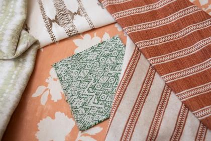
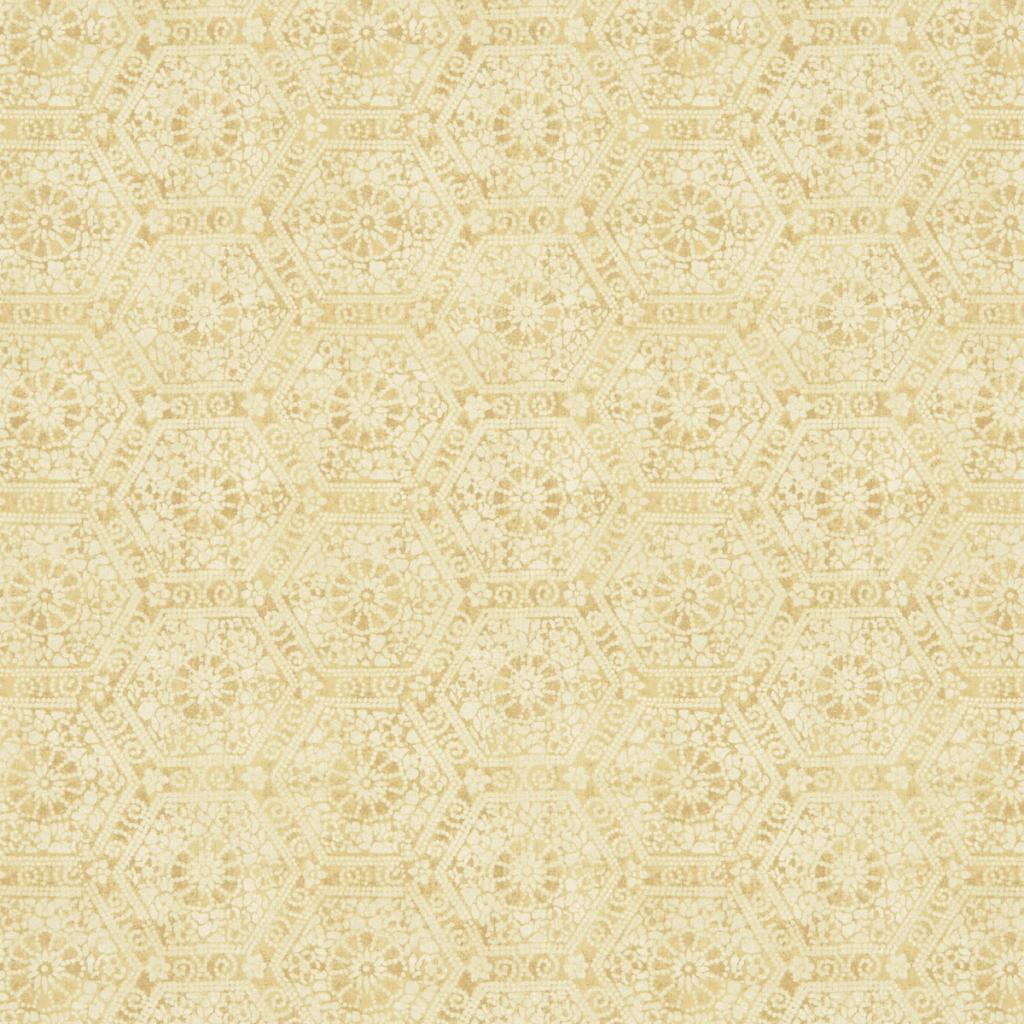
Our Nankeeng Wallpaper – which you can see in green – is a great example of this. While it features a very regular pattern of hexagons, the fact that it is hand-dyed and created with a gently worn finish means that it achieves a much more bohemian, relaxed, and traditional look, despite being design around very basic geometry.
Using geometric shapes to create unique patterns is something that artisans around the world have been doing for generations. There is so much versatility when it comes to these types of design work, and you don’t need to assume that a geometric print will inevitably carry that retro, mid-century feel. You can use geometrics to celebrate styles from all sorts of cultures and points in history – and, ultimately, to realise a unique, fresh vision in the home.
