


Decoration
The Core Principles of Scale and Proportion in Interior Design and Styling
Ever thought about how scale and proportion are impacting your rooms’ overall impressions? Click here to find out more about their importance.
The Core Principles of Scale and Proportion in Interior Design and Styling
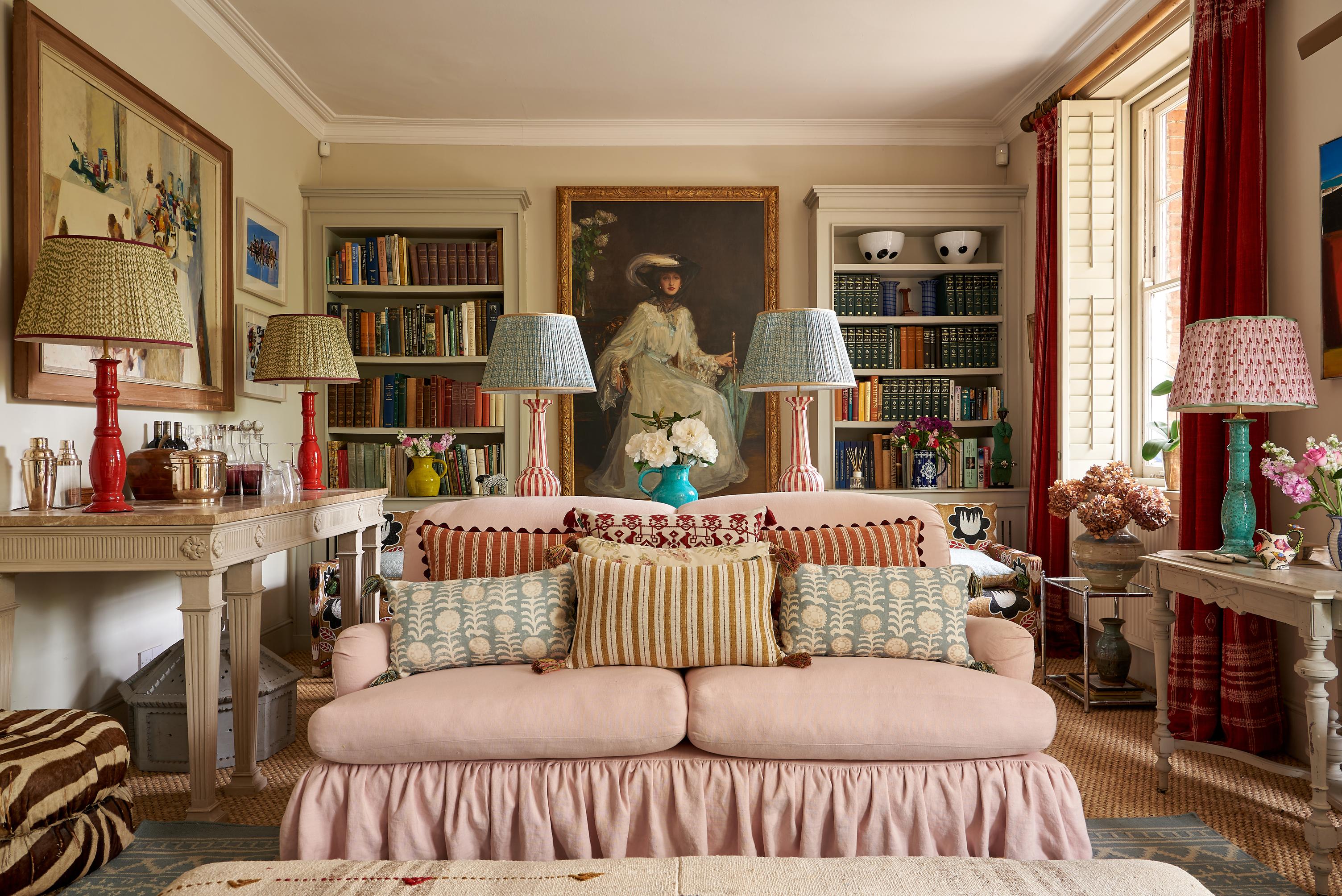
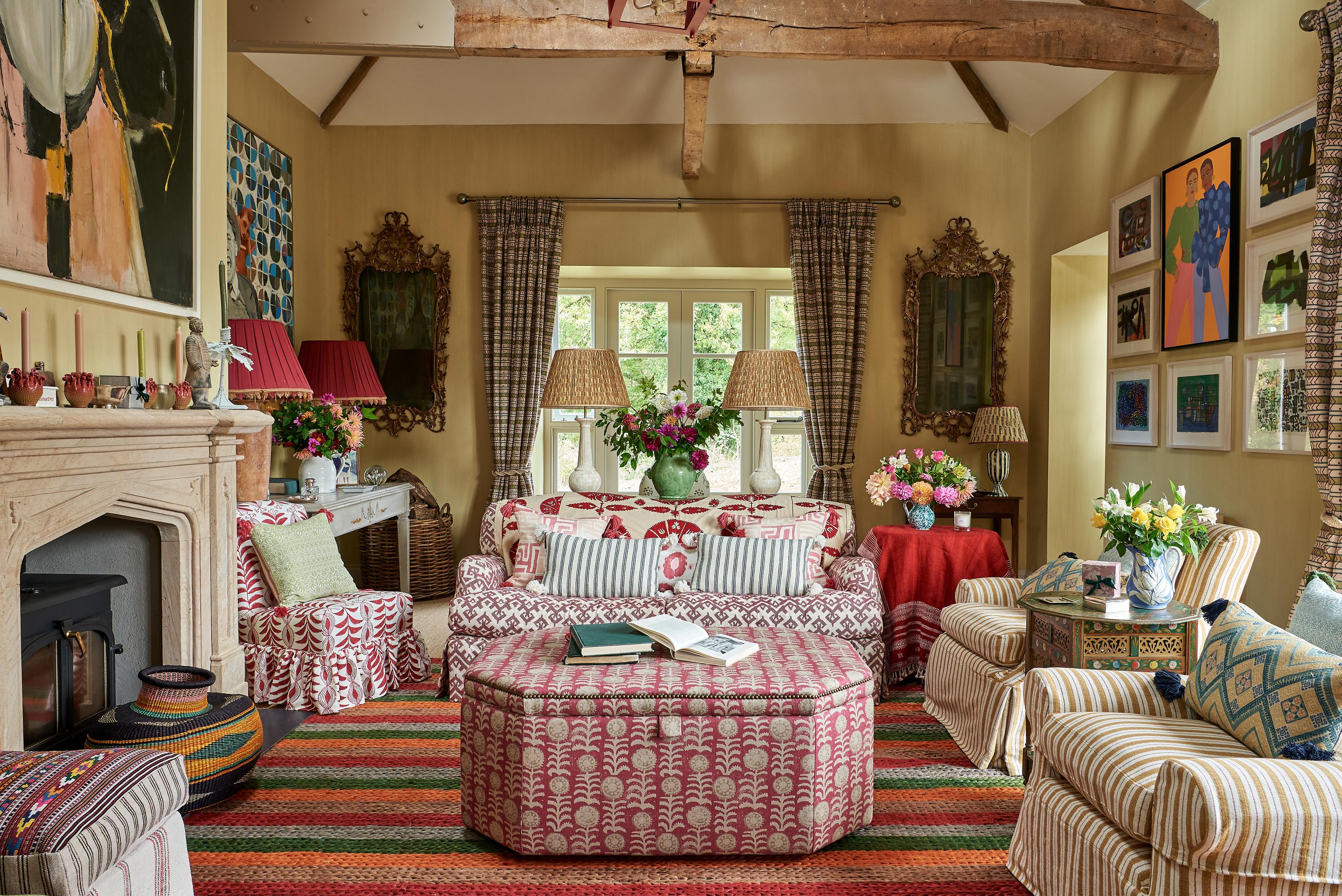
Sometimes, a room will simply fall together with very little effort. We arrive on the scene with an assortment of furnishings in tow, arms full of decorative elements destined for the walls and flat surfaces, and a hazy vision that, somehow, comes into fruition before our eyes.
Other times, there’s friction. The pieces that seemed so well suited in our heads just can’t harmonise, and the decorative elements designed to tie things together only seem to introduce more discord.
It’s not always easy to identify what’s going wrong. Separately, each element is beautiful and perfectly on-theme; together, they are beautiful but just not destined to be.
Whether it’s your lighting, your furniture, or the patterns you select for your soft furnishings and walls, everything benefits from consideration of scale, proportion, and hierarchy, particularly if you’re trying to troubleshoot an uncooperative space.
Considering the Room: The Crux of Scale
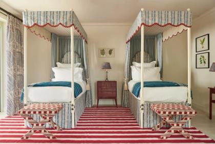
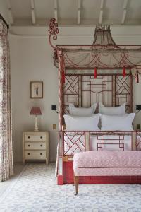
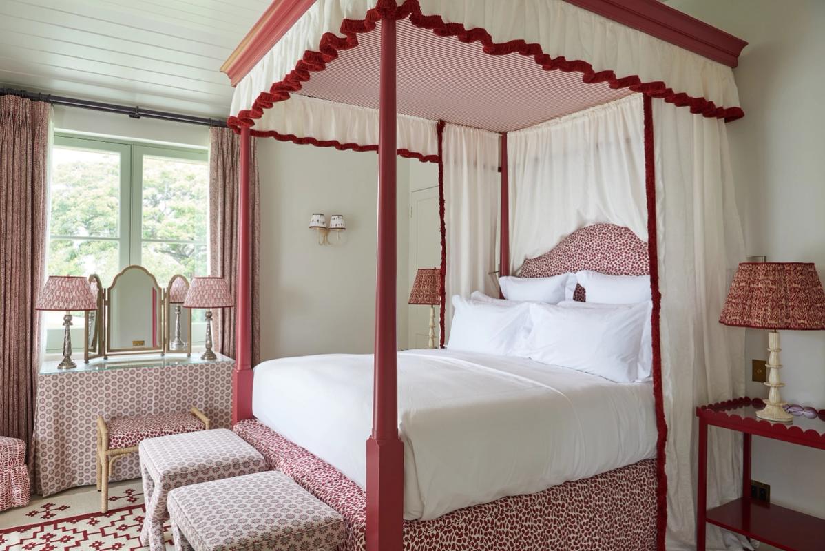
More often than not, a room will dictate the size of furniture it’s willing to accommodate. This is one of the simplest ‘rules’ of interior design – the fact that larger rooms are far better suited to larger pieces, and smaller rooms prefer smaller pieces. It’s certainly not a surprising revelation, but it works.
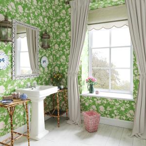
In fact, all the core rules of scale tend to be just as obvious but true: spatial scale means larger rooms suit much bigger areas of negative space between elements, while smaller rooms necessitate (and suit) the opposite. Big rooms have the strength to accommodate darker shades, while airier colours that create a stronger sense of openness are great for expanding the borders of a smaller room – or so they say. Plenty of professional and amateur interior designers have proven that one wrong over the years – even when it comes to painting the ceiling.
A few key pointers:
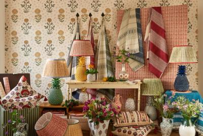
Considering Surfaces: Using Proportion for Hierarchy
Visual hierarchy is something a lot of people achieve subconsciously, but, more often than not, it’s the answer to why a certain view within the room is or isn’t working so well.
On any surface, decorative features should be bound to a clear hierarchy in terms of size and impact. If a sideboard is decorated using features that are all roughly the same height – even if some are weightier than others – then the view will feel a little off. With variance comes harmony – it enables every element to stand out in its own way. It’s a misconception that the largest piece will dominate everything else – the smallest elements can and will draw the eye.
It's often a good idea to make your decorative lighting the largest element on a particular surface. While its size and weight will draw the eye first, it will (quite literally) shed more light on the smaller elements beneath it, meaning visual hierarchy needn’t be achieved at the expense of some of your favourite elements.
A few key pointers:
More from Decoration