


Decoration
Neutral Colours for Your Home: Dull or Desirable?
Neutrals are often a go-to choice in today’s homes. Click here to find out if they’re too safe or the perfect option to create a beautiful, coherent space.
Neutral Colours for Your Home: Dull or Desirable?
When it comes to designing a dream home, choosing a colour palette is always ‘the fun part’ until you get going. Then it just becomes a whirlwind of self-doubt!
The problem with interior design is that, really, it’s all surface-level. Whenever you design a room, you’re designing something that appeals from an aesthetic perspective. People might not judge a book by its cover, but when that cover is the most important thing, lo and behold, people judge – and your own worst critic is yourself.
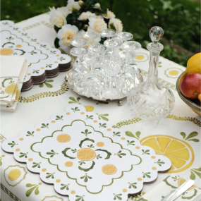
This is one of the key reasons why so many go for the neutral colour palette. From a design sense, the neutral colour scheme is a timeless investment, able to remain stylish for years and years, while all sorts of different trends come and go.
So, is it simply a safe decision, or is it the right one?
Dull or Desirable?
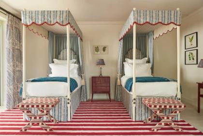
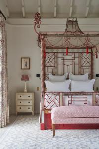
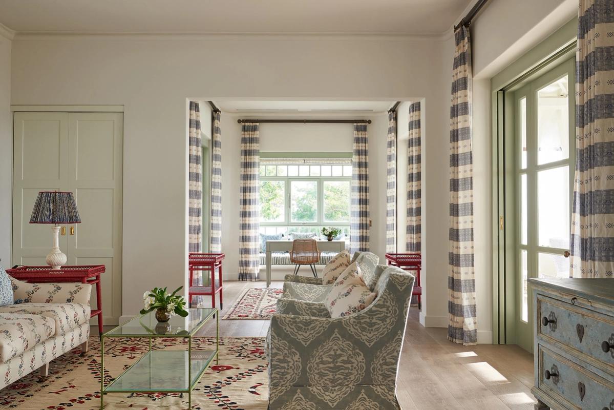
This is an interesting question, because both a neutral and a non-neutral tone can create an impact.
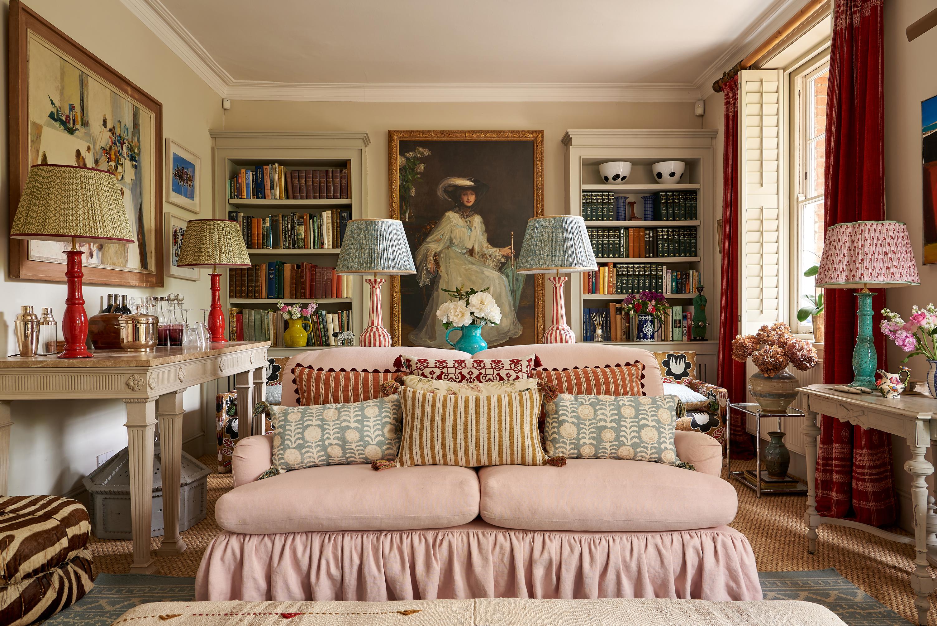
Toward the end of last year, Ideal Home editors revealed their top picks for an ideal living room. While they chose predominantly neutral tones for carpets, sofa upholstery, curtains, and flooring, their pick for wallpaper was a Scandi mid-century print, with bold geos and abstract, linear patterns.
This was obviously the most eye-catching of the lot. It was beautiful, elegant, and a complete show-stealer over every design feature on the list.
But the point is, there were neutral tones on that list, and all of them drew the eye in their own quiet and composed way. They may not have been as immediately eye-catching as the boldly patterned wallpaper, but they worked to light up the room with their sleek, timeless, and quietly stylish finishing touches.
With this in mind, inserting neutral tones doesn’t have to be a dull – or even a safe – choice. But it does have to be done with care and decision.
It’s All About the Light
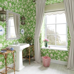
Firstly, 'neutral’ colours are not solely composed of white or black tones. They can incorporate a number of other pigments, each holding as much depth and beauty as any bold, colourful hue. The trick is matching them efficiently with both natural and artificial or decorative lighting.
The first thing you will need to take into account is your sun-exposure – the direction in which your room is faced. South-facing rooms, for instance, receive a large amount of light throughout the day, and can end up making heavy colours – and even pigmented neutrals – look overbearing and sickly.
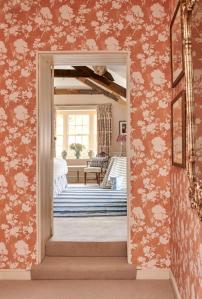
North-facing rooms, on the other hand, get less light, and can easily feel dingy with basic colours. In this way, you would want to decorate those rooms with warm undertones – light hues or red, pink, yellow, or any colours at the warm end of the spectrum.
For east and west-facing rooms, the time of day in which you use those rooms becomes significant. East-facing rooms will receive warm light in the morning, and become darker in the afternoon, while west-facing rooms will start cold, and get progressively warmer as the day progresses. So, to pick your tone appropriately, you will need to think about when you use the room most, and then balance the qualities of the light with either a warm or cold neutral.
You can also use artificial lighting to tackle these areas. Say, for instance, the room starts warm and gradually turns darker, artificial lighting can highlight the changing nature of the room by shifting the neutral hue as the day moves on, creating a space that both changes in character and feeling.
A Hard Task, But a Meaningful Reward
Do you see what we mean when we say, ‘care and precision’?
If you’re struggling to formulate your colour scheme, you can’t simply place your finger on ‘true white’ and hope that it will work because, unless all your rooms are south-facing, even true white can become sterile!
For artificial light, too, you have to understand that different bulbs create different hues – for instance, a cool light will contrast with true white tones, while a warm light will diminish off-white and yellow undertones.
This is all about getting a feel for the room, understanding its nature, understanding the light, and then working out which colour appropriately neutralises that specific space.
Once you have done this, you can begin to build on top of your work. You can add smart pops of colour, introduce decorative lamps, or simply keep to a coherent, stylish neutralism. From that point on, it’s up to you. But if you want to avoid your space looking dull or uninspired, you need to put the work in first!
More from Decoration