


Decoration
Is Brown the Toughest Colour to Decorate With?
Brown is rarely regarded as a popular primary colour for a room, but it offers its own beauty, benefits, and appeal to interior design. Click here for more.
Is Brown the Toughest Colour to Decorate With?
Brown has a rather unfavourable reputation compared with its peers. What we grew up knowing to be the product of too many different hues mixed together on the paint palette, the appearance of unappealing puddles of water, and what was left when the foliage receded in November, has so far only proved somewhat effective at outgrowing its own reputation.
While colour psychologists believe that brown’s undeniable connection to earth and terra firma means it evokes a sense of steadfastness, resilience, and dependability, brown is also associated with feelings of isolation and, unfortunately, sadness.
But, as we all know, colours can be restyled away from their old connotations. Red needn’t be an overly stimulating colour and green needn’t represent repressed jealousy any more than pink needs to be reserved for baby girls or blue for the bathroom tiles. Colours have been stepping out of their pre-assigned roles for almost as long as they’ve been assigned them, so why is brown still something of a maligned hue for redecorating?
Earlier this year, House and Garden announced that brown was the colour du jour, but even they acknowledged the ‘love it or hate it’ sentiment surrounding the colour.
So, why is it so hard for us to trust in the earthiest colour of all?
A History as a Base
Just as, in nature, brown tends to recede into the background – the trunks of trees, the leafy floor beneath flowering plants, the dirt just visible between blades of vibrant green grass. Wooden table legs peeking from beneath beautiful linens, sideboards adorned with more distracting objects and curios, the floorboards between rugs and furnishings, the dado rail that separates block colour from distractingly beautiful wallpaper prints…much of the time, brown is the base upon which we build.
Of course, brown can take centre stage. The 1960s saw many homes decorating their rec rooms with vertical panelling that drenched spaces in a warm, enclosing shade of well-varnished brown. The classic ‘Gentleman's study’ – at once timeless and rooted in moody Victorian fashions – is a masterclass in the rich and sombre charm of a room cloaked in brown.
But, for the most part, brown is typecast as an inevitable part of a room’s base – inherently limited, rather than an exciting focal point.
Trouble clashing
Every colour has its rival. Red and pink, blue and green, yellow and white – but, for every room that struggles to overcome those colour ‘rules’, there are five more that turn a cardinal sin into a beautiful, memorable scene.
Brown is subject to the same rules. A warm colour – it tends to be seen as a poor match for other warming tones like red and orange are treated as poor matches, despite the fact that, under most theories, brown is technically a ‘neutral colour’.
Interestingly brown is not really a real colour at all – and that’s why it does not appear on the traditional colour wheel. It is known instead as a composite colour – which is precisely why children’s painting sessions inevitably end in brown!
A New Home in Biophilic Design and Rusticism
As we mentioned earlier, brown is enjoying a renaissance in interior design and, given the new trend for slower design, sustainability, rusticism, and biophilic design.
We’ve written more extensively about the principles (and appeal) of biophilic design in this article, but suffice to say that more and more of us are looking for ways to root our homes in nature and feel a greater connection to the organic world around us.
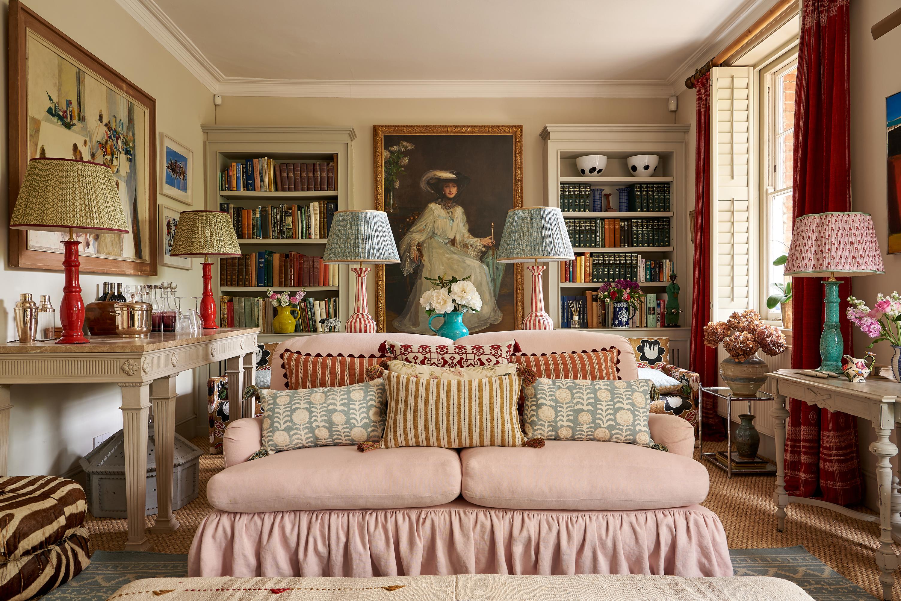
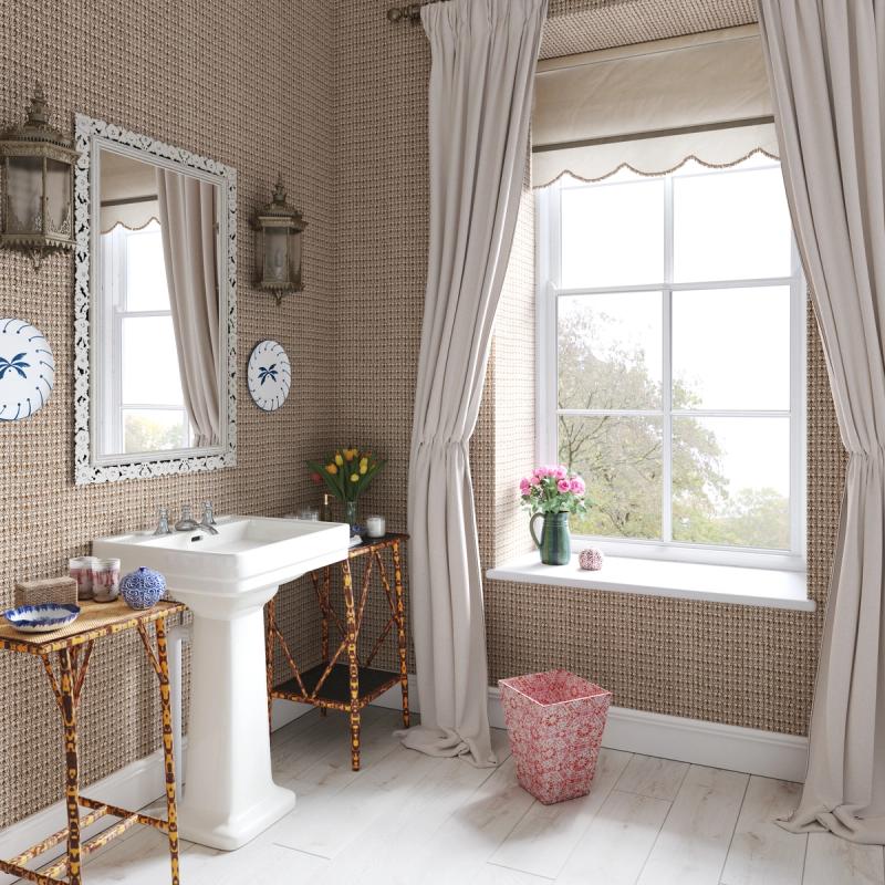
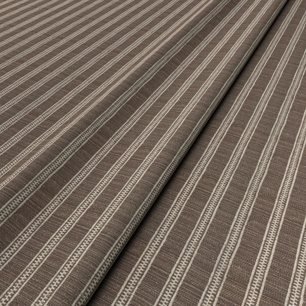
Alongside green, brown is the ideal colour for more mindful homes. It needn’t be reserved for wooden accents, either – the colour alone offers a grounding, dulcifying atmosphere to a room. Brown fabrics – particularly when they’re woven from natural fibres like flax (linen) or cotton – are very effective at capturing a more natural philosophy. Light and airy linen is also great for tempering brown’s heavier mood, so avoid equally heavy textiles like velvet.
The right lighting will add more warmth to a brown wall or print, while a strong palette or accent colours – a cheery terracotta and a bright teal to introduce a little more brilliance back into the space – will ensure it never feels dragged down under its own weight.
Brown’s weaknesses as a primary colour for decorating are now being turned into its greatest strengths. From the revival of wood panelling to a philosophy of interior design that favours sustainability and natural resources over fast production, brown represents a new era for design – and we can’t wait to see more of the results.
More from Decoration