


Decoration
How to Avoid a Pattern Clash Between Your Wallpaper, Curtains, and Upholstery
How to Avoid a Pattern Clash Between Your Wallpaper, Curtains, and Upholstery
If, like many design enthusiasts, you prefer to be led by a unique combination of mood, taste, and that undefinable instinct each time you go looking for fabric, then there’s a good chance that you’ve returned home stumbled into the issue of incompatibility at least once before now.
We’re talking, of course, about the tricky business of buying fabrics in isolation – choosing them because you love them and because they’re right for your home’s style – and only realising that they’re not quite in harmony with one another once you finally get them in the same room.
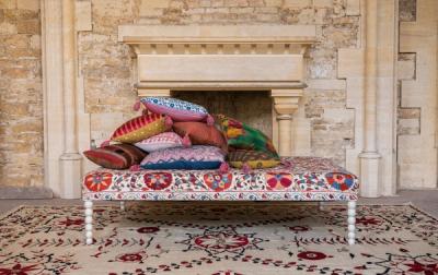
But the idea that everything has to be perfectly coordinated is only valid for one particular approach to interior design. The and bohemians of the world will always be ready to offer proof that mixed patterns and colours can be the ultimate intentional design choice.
But there is a difference between ‘creative disharmony’ and colours and prints that are just downright clashing with each other. Here’s how to achieve one, and avoid the other…
How many pattern styles are you willing to integrate?
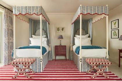
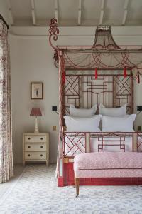
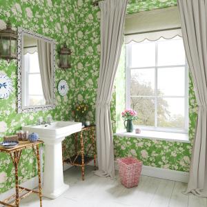
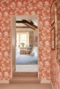
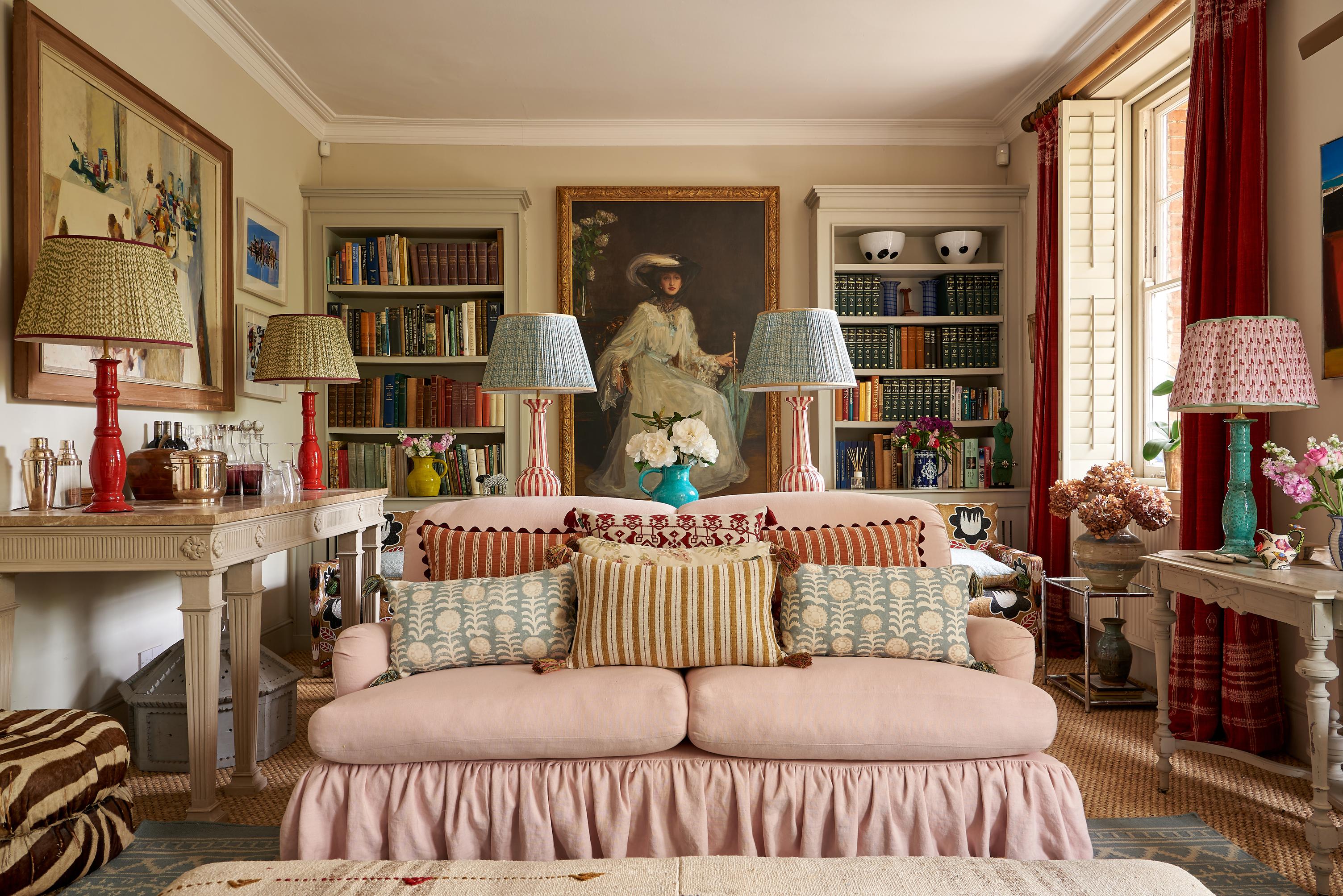
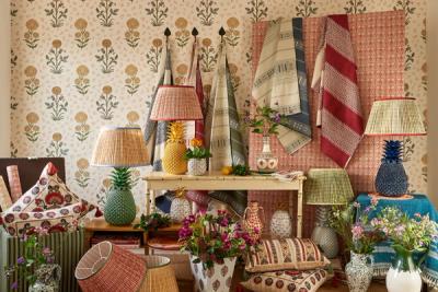
It’s a special kind of room that can support a handful of contrasting florals, or a variety of different stripes or geometrics. It may seem like the obvious way to find harmony – taking a like-for-like approach and sticking to one style, whether floral or geometric or abstract – but, actually, it’s an easy way to create a sense of rivalry between your wallpaper, curtains, upholstery, and décor.
Introducing more variety in terms of style is generally more effective at letting each pattern stand on its own two feet and avoid competing with another part of the room.
If you opt for a floral wallpaper, then consider choosing a stripe or geometric for the curtains – preferably of a different hue, so that one is more likely to nab the eye at first-glance than the other. You don’t want to feel torn between two prints, but as though your eye is naturally gliding from one (the most obvious) to the next (the more subtle).
When you consciously untie yourself from a rule, you naturally allow yourself to be more creative, to avoid relegating yourself to a very specific theme, and to have a more enjoyable time at the fabric shop.
And how many colours?
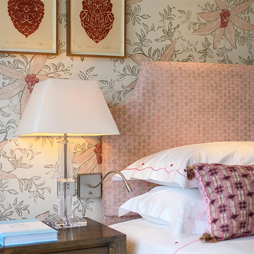
Once again, it’s easy to assume that the best way to avoid any potential clashes or incompatibilities is to be relatively firm about creating and sticking to a colour scheme. If every single pattern, no matter how different, follows a blue-and-white scheme, for instance, then it’s less likely to clash. Or is it?
The trouble with working to a prescriptive colour scheme is that, for the most part, you will face a big struggle to find consistency across multiple different fabrics, wallpapers, and other decorative elements. Think of how many shades of blue there are – how many shades there are, even, of white – and how unlikely it is that you’ll find a store of fabrics and wallpapers that feature the same shades.
And, the closer you try to get, the more they will appear to clash, since those subtle differences will become less subtle – particularly as the lighting changes throughout the day.
It’s always worth having a colour scheme in mind for a room, but the ideal colour scheme (unless you’re a committed minimalist) will be a lot broader and a lot less prescriptive than you might think. A room full of varying blue patterns will be competing with itself; a room that is less restricted will find a more natural balance.
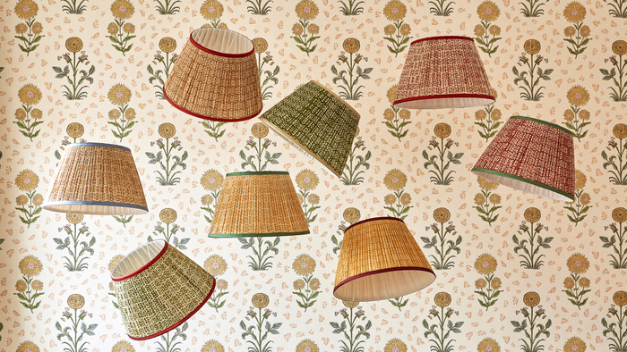
Are you making the most of samples?
There is a very good reason wallpaper samples exist, and it’s for precisely this dilemma.
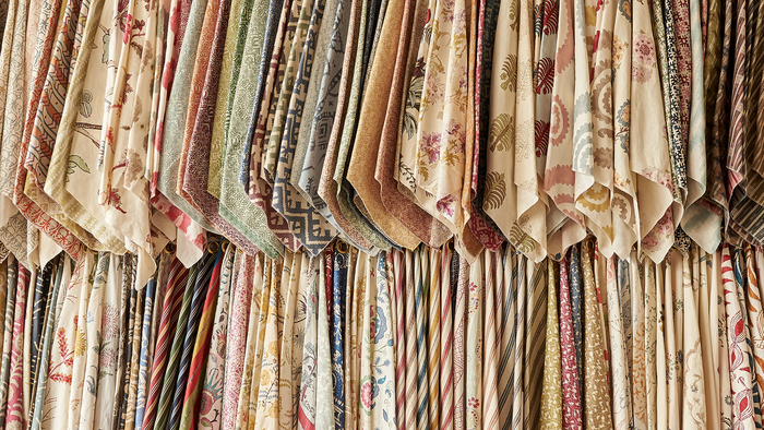
In an ideal world, you’d be choosing and introducing all those different patterns at the same time – a process that, while not straightforward, is easier than introducing an entirely new print to an existing space. But, in either case, using wallpaper samples to see the way your different patterns interact with one another (rather than just visualising it) is key.
In your head, two patterns may go together perfectly. Then again, they might not. In reality, those same two patterns may look completely wrong alongside one another – colours might clash, or the interplay of form or negative space might just run against all of your expectations. Click here to make use of our journal to getting the most benefit from wallpaper samples.
The same goes for prints you didn’t expect to work. If you take the time to order samples, you might just be surprised.
More from Decoration